Tiny Christmas Tales. Part V. GermanyMapJanuary 4–5, 9, 2014 Driving through endless farm fields, I suddenly came across a sort of poor man’s Disneyland called Europa-Park. It’s a giant amusement park where all the pavilions are European country-themed. A triumph of kitsch. 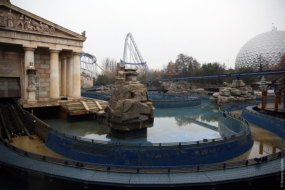 One of the pavilions is dedicated to Russia, of course. Who doesn’t recognize those famous onion domes sprouting from random overhangs? 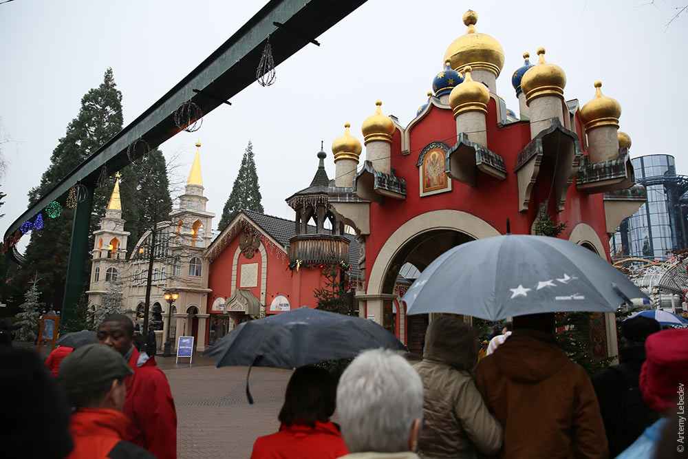 Coca-Cola used a Cyrillic logo when it first came to Russia, but then abandoned it. But apparently it’s fine here. 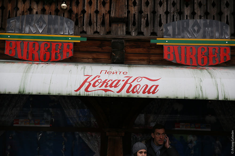 One of the pavilions is sponsored by Gazprom for some reason. In addition to a rollercoaster called Blue Fire, there’s a pretty boring exhibition hall that looks like it was created by a management committee of fifty people. Even the hallway to the bathrooms seizes the opportunity to nudge visitors and remind them that “energy is a world of adventure.” 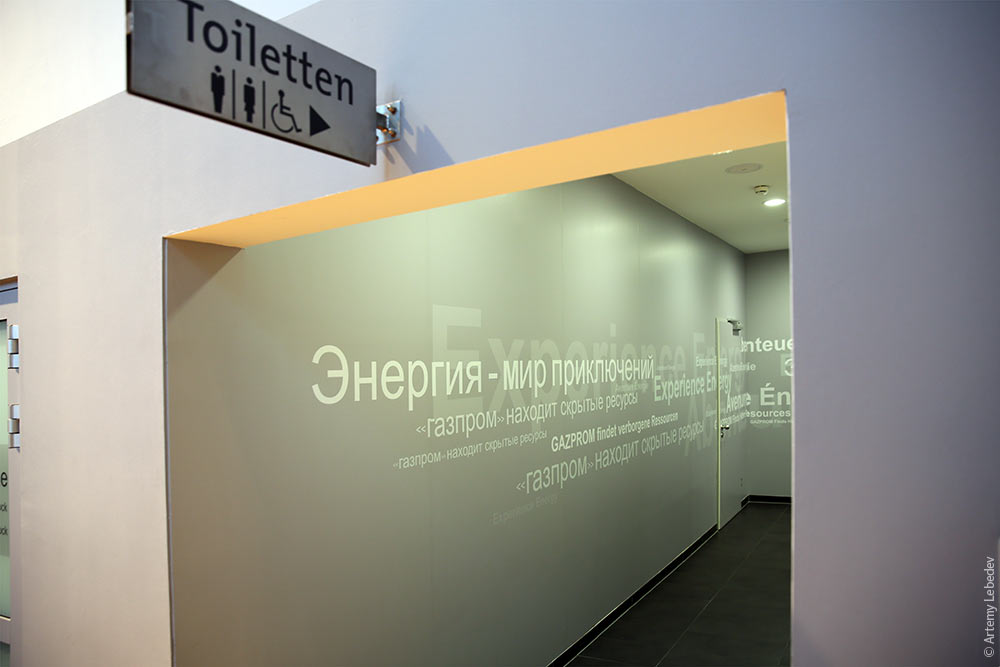 Meanwhile, outside, there’s a burn barrel for anyone in need of warmth, with logs the size of elephant legs. It’s funny—this is Europe, after all, it’s cramped and resources are scarce, yet no one has any qualms about burning actual pretty trees. In Russia, a bunch of environmentalists would immediately come running and sound their alarms about how we hardly have any forests left as is, and we’re setting a bad example for our children. And a gas heater would be installed instead. (We still have a long way to go to catch up with Europe: instead of real Christmas trees, we put up metal cones on our squares for the holidays.) 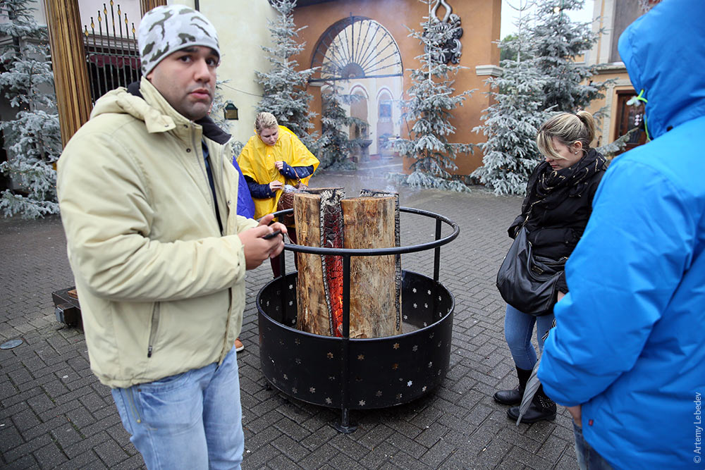 FreiburgMapGerman typography evolved somewhat in isolation from the rest of Europe. A blackletter typeface called Fraktur was used as the body type for every kind of text, from novels to street signs. Antiqua (the letters you’re reading right now) was used for scientific publications. The Germans were completely enamored with Fraktur and refused to use anything else. Fraktur was associated with German culture, history and character. Many a treatise was written to prove that Fraktur was more fitting for the German language than Antiqua. It was particularly funny when the Germans tried to distribute pamphlets in French, but set in Fraktur. The French simply couldn’t read the text—to them, it might as well have been the font from the closing credits in The Matrix. In 1941, Hitler issued a decree banning Fraktur, on account of it being alien to progress and the Nazi spirit. In his own time, Peter the Great made a similar decision when he ordered a switch to European type for all secular purposes, thus abandoning the frilly Old Slavonic script. Nonetheless, the Germans still like to use Fraktur for street signs and train station names. 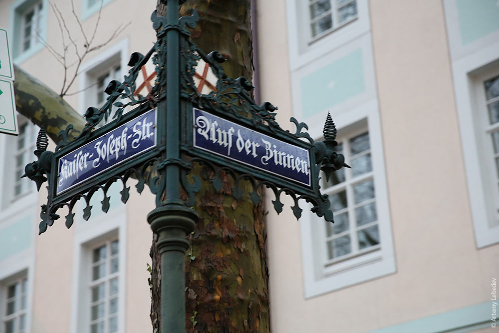 KonstanzMapA wonderful little town, peaceful and charming, on the shore of a pretty lake. 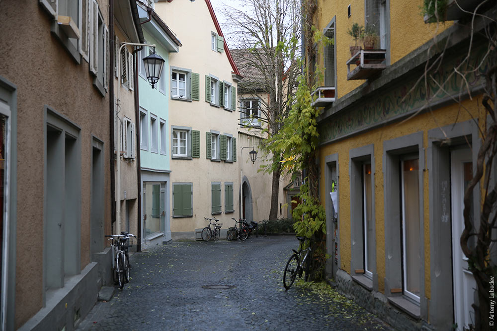 The German—Swiss border passes right through the middle of the city. The German part is a million times nicer and more interesting. It seems like there’s no rush to get rid of the border checkpoints themselves. 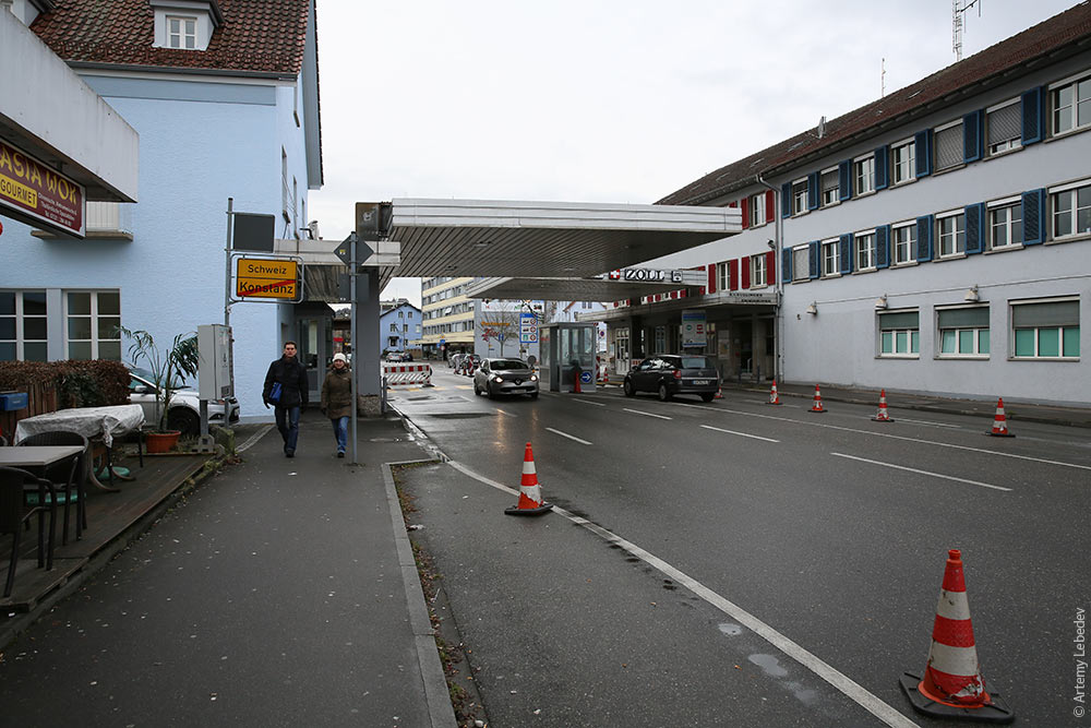 A group of sculptures on the main boulevard. If a delegation of Russian city officials ever visited Konstanz, the mere sight of these would make their brains explode.  MunichMapThe Munich airport has new information kiosks that consist of a screen with a live image of a woman, who tells you which way to go using hand gestures.  |